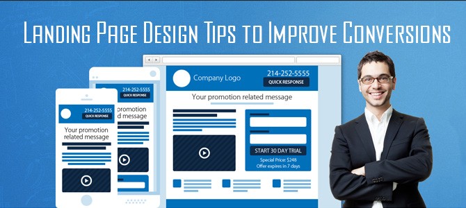
Landing Page Design Tips to Improve Conversions
Sometimes you can judge a book by its cover. If your landing page leads your audience to no man’s land your cover may be telling a story you don’t want to hear. Your landing page should work to effectively lead people to your specific call to action. If it doesn’t convey a strong clear message that guides your audience to a specific CTA your page will fall short of converting mere window shoppers into customers. This is where effective web design strategies become paramount to maximizing conversions.
Your Page Design Should Display a Clear Call to Action
There should be no guesswork when it comes to zooming in on a clear call to action. Your audience should not have to guess or hunt for this. Make sure that there is a visually distinct button displayed on your landing page that clearly invites your audience to take action. Less important CTA’s shouldn’t compete for the attention of your audience. Make them smaller and less distinctive. Your primary CTA should be clear and visually impactful with helpers like arrows and other graphics that clearly guide your audience to click a button that represents your CTA.
Create a Compelling Offer
Any incentive you offer to potential customers should draw them into the conversion tunnel further. The offer serves as bait to help potential customers respond in the manner in which you want them to. This is often an offer for a free trial or discount, however, there are many incentives that can be offered to potential customers to draw them in. The offer can even be paired with a deadline to create more urgency, however, regardless of what you use as click bait, make sure that the offer remains distinct from the CTA. You don’t want to create competition. The focus should still be to lead your audience to the CTA. The offer is just another tool to help achieve this end.
Centralize Your Focus
Don’t throw too much at your audience all at once. Make it clear and simple for your audience to do what you’re asking them to do. This may seem easier said than done but it’s really isn’t. Keep the focus of your content centered on what you want the audience to do. Let your visuals do some of the work for you by using white space to denote the core areas of the page. Administrative information should be kept towards the bottom of the page in a less visually distracting manner. Use placement and space to keep the focus of your message clear and simple.
The design of your landing page plays a fundamental role in motivating your audience to respond to your CTA. If the message is unclear or lost in a forest of other invitations, your page may not be doing what it’s supposed to. The design of your landing page should display a clear distinct message which easily guides your audience to do what you want them to. It doesn’t take much to create a landing page that draws your audience in and clearly guides them to your CTA through the use of compelling offers and visually distinctive strategies.