Google Browser Size: See how others view your website
3 mins read
Website standards are very important to convey your message to your larger audience. A website has to be structured in a way, which can be accessible for everyone and some of your visitors resolution may not correlate with your website’s resolution. This results in losing your visitors. How to avoid such scenarios? Google has an answer – Google Browser Size. It is one of the hottest tools in the Google Labs right now.
Why Google Browser size? The reason behind launch of Browser Size is to help web designers ensure that featured content is “above the fold”, which means letting your users read the content even without scrolling down. Still people have a screen resolution of 800*600, which may or may not be higher than your website resolution and which may result in visitors viewing only three-fourths of your content. For instance, if we create a feedburner button and place it at the bottom of the page it can be viewed by 80% of the people and the remaining 20% can view only if they scroll down the page (due to their screen resolution).
Google has done a good job of coming up with a service like Browser Size. The importance of this tool is to ensure the important parts of a web page’s user interface are visible to wider segment of visitors. This would help designers reconstruct a web page for better reach of audience.
How to use Browser Size?
Point your browser to www.browsersize.googlelabs.com and enter your blog or website URL and click Go. This is how it looks:
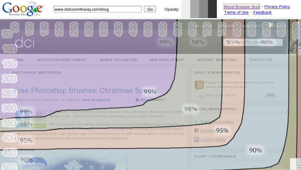
Features of Google Browser Size:
- Google lets you to change the opacity colors, by clicking the boxes next to go button.
- If you move your mouse around the window, you can see a rectangular box. This feature lets you to normally browse your website, with the graphical overlay. This helps you analyze all the pages (if necessary) on your website.
- The sizes represented in this contour are client area sizes, not browser window sizes. This means they represent the size of the browser without the title bar, toolbar, status bar etc., and thus give a true representation of how much content can be seen by a particular segment of the Web-using population.
- Browser Size works best on web pages with a fixed layout aligned to the left. If the content re-flows as the width is adjusted or it is centered, then the results can be misleading. In this case, you can obtain more accurate results by reducing the browser width to a percentage column, e.g. 90% and seeing what content falls below the 90% horizontal line.

![The Game Marketing Guide: Pre and Post-Launch Strategies [Infographic]](https://www.dotcominfoway.com/wp-content/uploads/2023/09/DCI-Game-Marketing-blog-1.jpg)
Latest Posts
 July 08, 2026
E-commerce in the zero-click era: how to make sure AI recommends YOUR product when shoppers skip the search results
The e-commerce buying journey is moving beyond traditional search, making AI product recommendations for e-commerce increasingly important. Shoppers now use ChatGPT, Gemini, Perplexity, and Google AI Mode to compare products and make purchase decisions. This creates a new visibility challenge....
 July 06, 2026
Email Marketing Is Not Dead: 7 AI-Driven Tactics That Are Driving Open Rates Beyond 35%
Email marketing is not dead. Generic email campaigns are. Customers now expect relevant messages based on their interests, behaviour, and buying stage. AI-driven email marketing tactics help businesses replace mass campaigns with predictive segmentation, personalised content, and smarter automation. Achieving...
 June 25, 2026
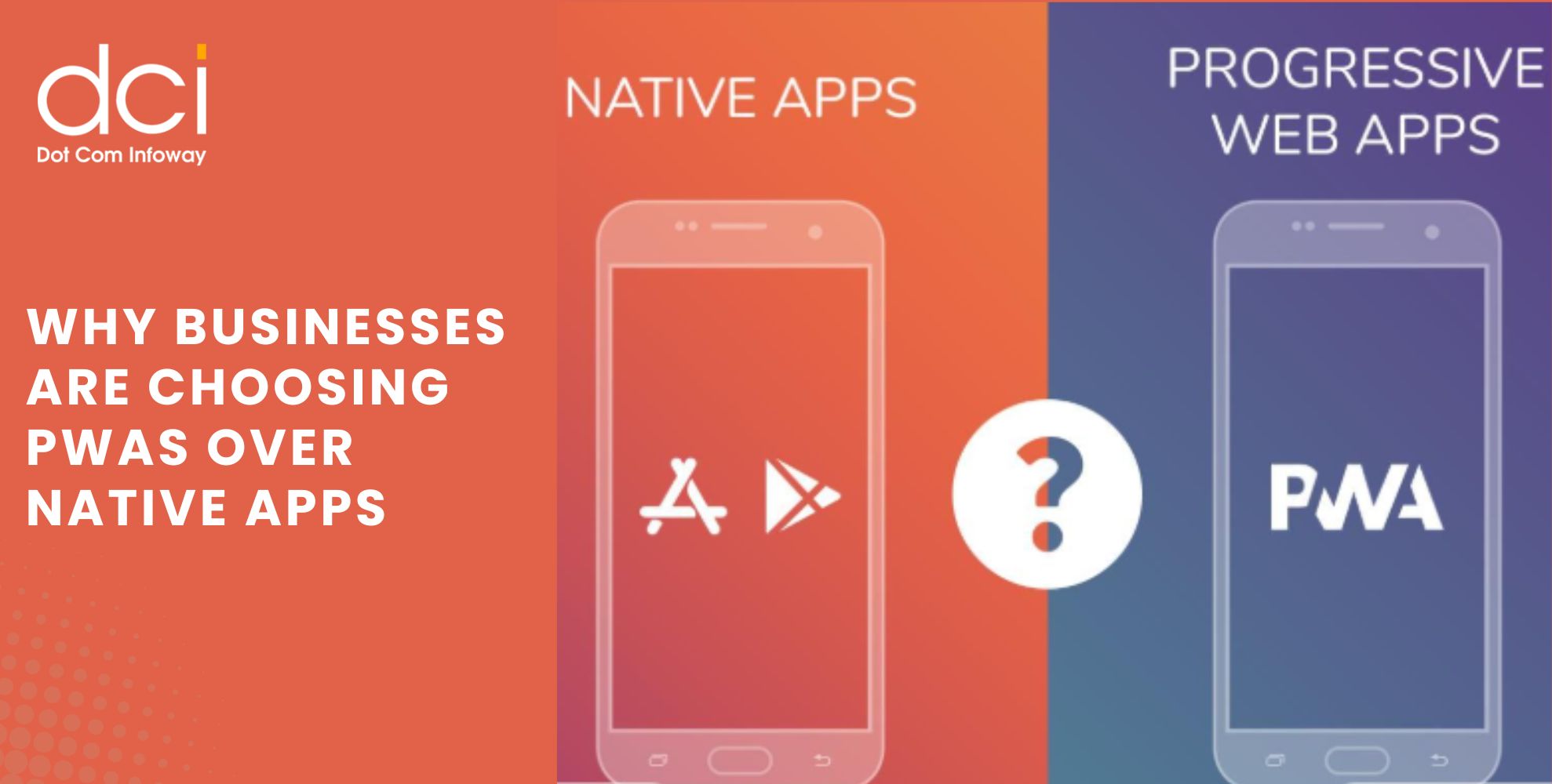
Why Businesses Are Choosing PWAs Over Native Apps: How One Brand Reached 3X More Mobile Users
Mobile users expect fast, reliable, and seamless experiences across devices. As businesses evaluate the best app development service strategies to improve customer engagement and maximize ROI, many are increasingly choosing PWAs Over Native Apps. Progressive Web Apps (PWAs) combine...
 June 22, 2026
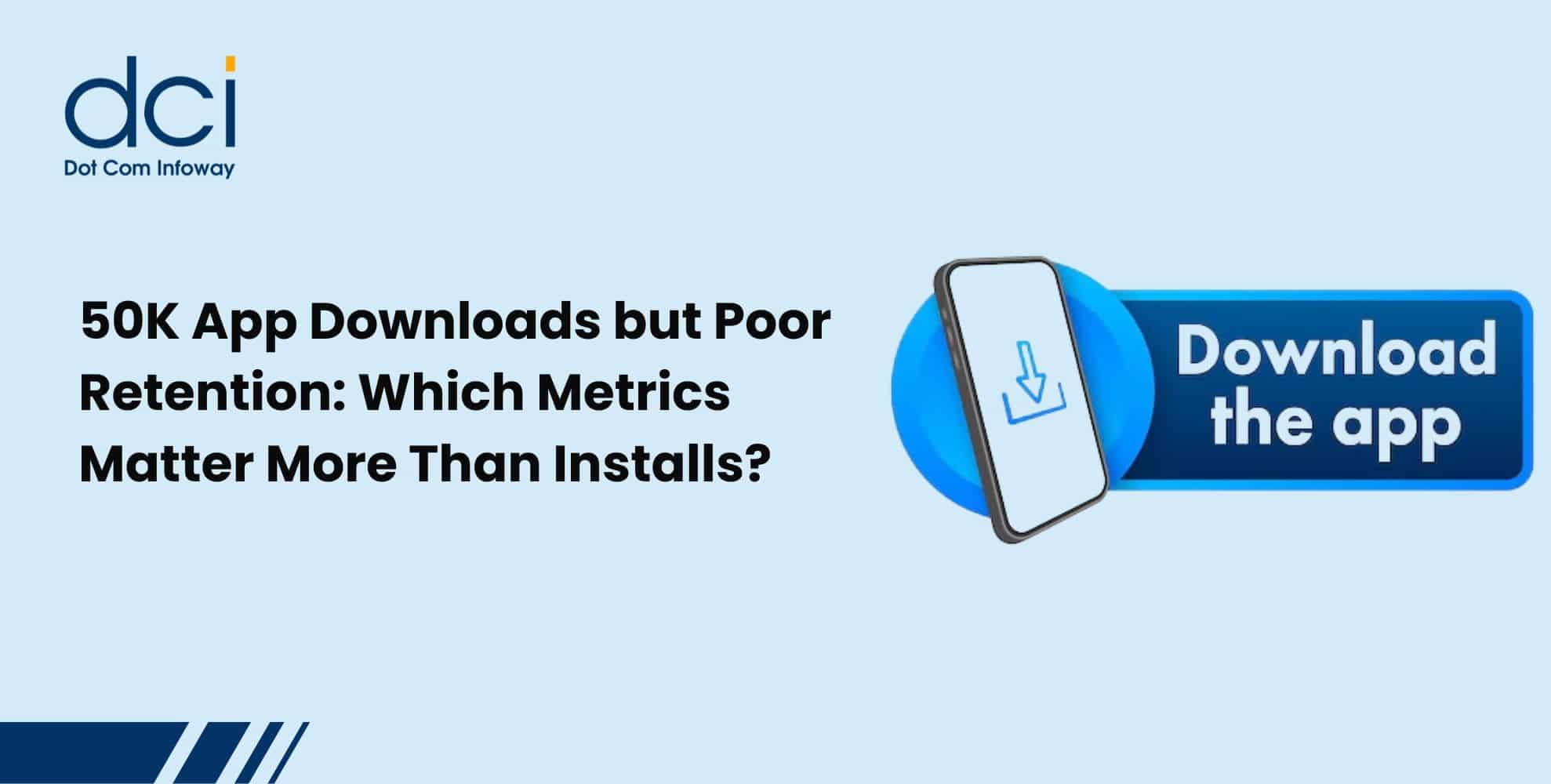
50K App Downloads but Poor Retention: Which Metrics Matter More Than Installs?
Getting 50,000 app downloads is a milestone that many businesses celebrate. It often indicates that user acquisition campaigns, app store visibility, and marketing efforts are generating results. However, downloads alone do not determine whether an app is truly successful....
 June 18, 2026
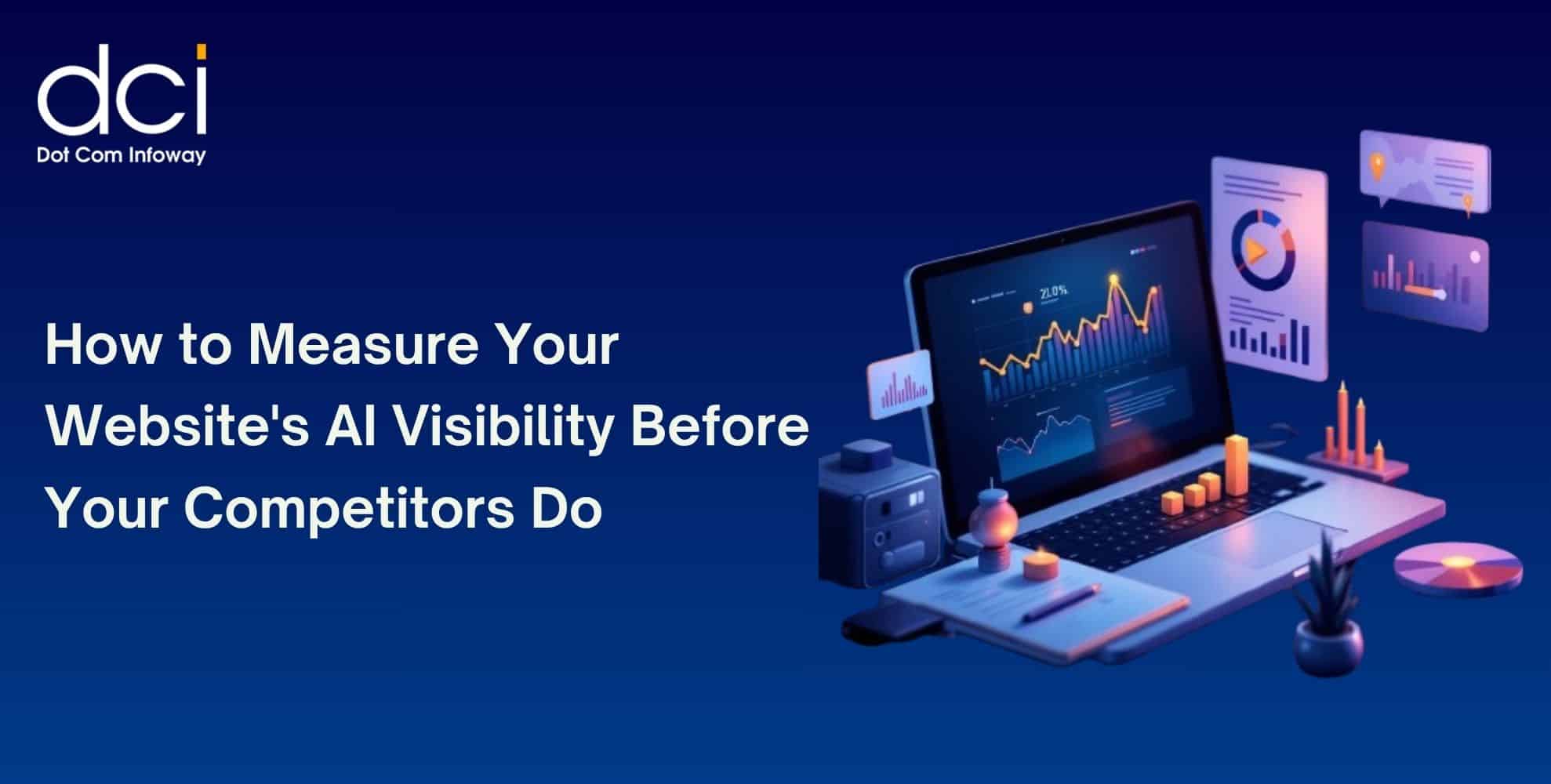
How to Measure Your Website’s AI Visibility Before Your Competitors Do
The way people search online is changing rapidly. Instead of browsing through multiple search results, users increasingly rely on AI-powered platforms such as ChatGPT, Gemini, Perplexity, Claude, and Google AI Overviews for instant answers. As a result, AI Visibility...
 June 15, 2026
How Founder-Led Marketing Drives Business Growth: Insights from Dot Com Infoway’s Webinar
In today's highly competitive digital environment, businesses are finding it harder than ever to earn customer trust. Consumers are exposed to countless ads, social media promotions, and AI-generated content every day. As a result, authentic communication has become a...
 June 15, 2026
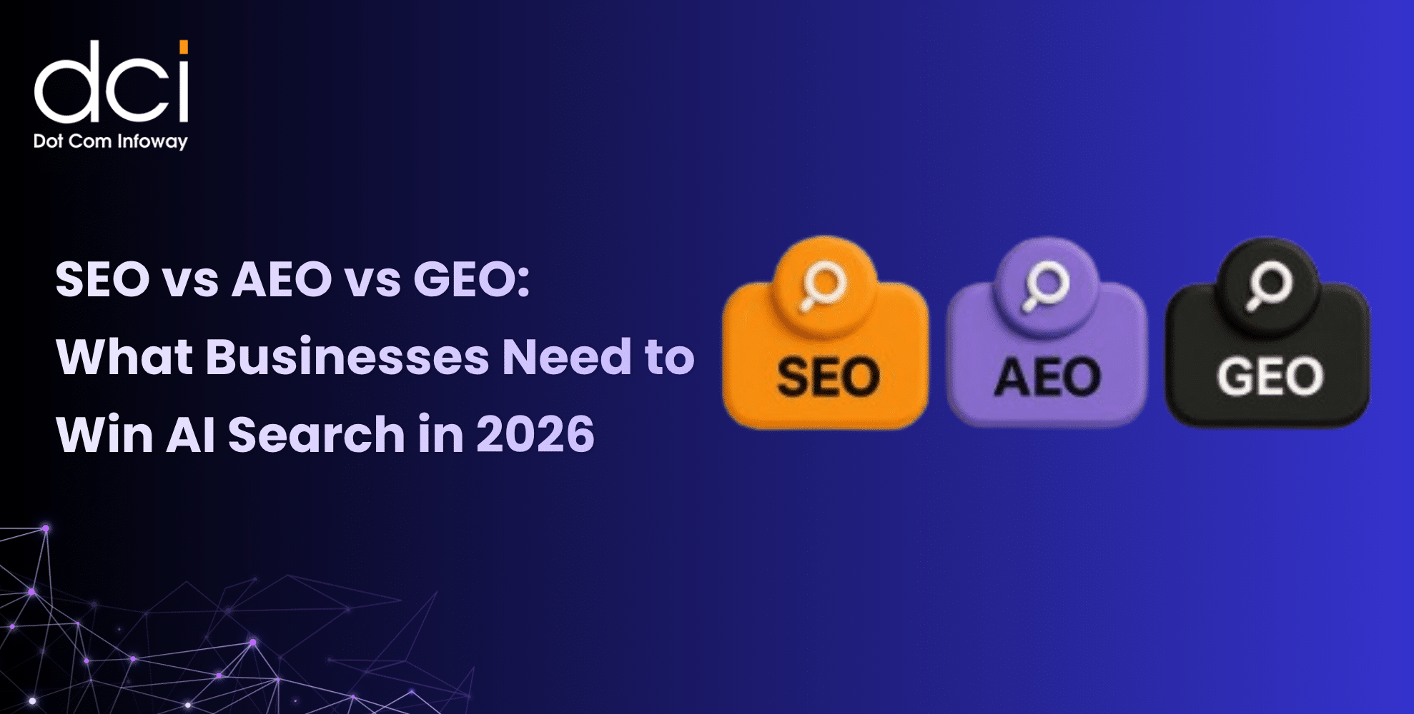
SEO vs AEO vs GEO: What Businesses Need to Win AI Search in 2026
The way people discover information online is changing rapidly. Instead of relying solely on Google search results, users are increasingly turning to AI-powered platforms such as ChatGPT, Gemini, Perplexity, and Google AI Overviews to find answers, compare solutions, and...
 June 12, 2026
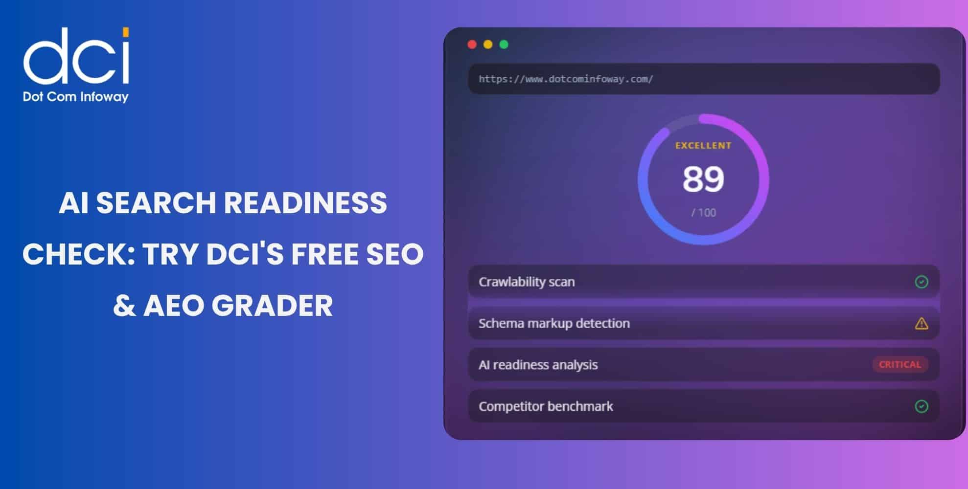
AI Search Is Reshaping Discovery: Use DCI’s Free SEO & AEO Grader Tool to Measure Your Website’s Readiness
Search is changing fast. Users now ask ChatGPT for recommendations, compare options on Perplexity, read Gemini summaries, and check Google AI Overviews before visiting websites. This shift makes the SEO & AEO Grader Tool important for brands that want...
 June 11, 2026
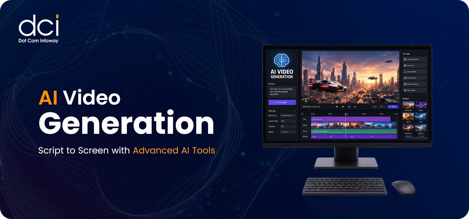
AI Video Generation: Script to Screen with Advanced AI Tools
AI video generation is reshaping how brands, creators, and studios produce visual content. With advanced AI tools, teams can turn scripts, prompts, blogs, images, or product ideas into ready-to-publish videos for ads, reels, trailers, explainers, and campaigns. How can a...
 June 10, 2026
E-E-A-T in the Age of AI: Why Google’s Trust Framework Is Now the Gateway to Both Organic and AI-Generated Visibility
Search visibility is changing quickly. Ranking on Google is no longer only about keywords, backlinks, and technical SEO. The Google Trust Framework now plays a major role in how brands build credibility across Google Search, AI Overviews, ChatGPT, Gemini,...
Get the latest insights from Dot Com Infoway straight to your inbox.