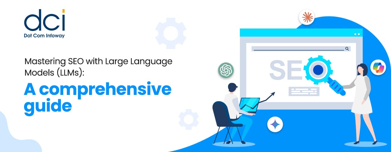
Multiple Rounded Corner CSS Boxes Using a Single Image
6 mins read
In web designing, rounded corners play a vital role in various places. They not just look good but also allow one to create unique effects. There are many methods to achieve this effect. And, we have come up with a very simple, clean and reusable technique to create multi-sized rounded corner CSS boxes using a single image with drop shadow effects. In this short tutorial, we’ll explain you on how to achieve this effect with a simple example.
Before we proceed with this example, what we need is a basic knowledge in CSS and a solid colored background image with rounded corners. You can choose whatever color theme you want for the boxes and a drop shadow effect can be added to the image as given in this example.
In this example, we have created three CSS boxes in different sizes. After downloading the file, upload the CSS file to your server and add the path in the shown script.
<link href="css/styles.css" type="text/css" rel="stylesheet"/>
HTML
The HTML given here contains three div for each boxes assigned and other div for content and positioning of the boxes.
<!DOCTYPE html PUBLIC "-//W3C//DTD XHTML 1.0 Strict//EN"
"http://www.w3.org/TR/xhtml1/DTD/xhtml1-strict.dtd">
<html xmlns="http://www.w3.org/1999/xhtml">
	<head>
	<meta http-equiv="Content-Type" content="text/html; charset=iso-8859-1" />
<title>Multiple Rounded Corner CSS Boxes Using a Single Image - Example
</title>
	<link href="css/styles.css" type="text/css" rel="stylesheet"/>
	</head>
	<body>
	<!--Over All div Starts Here-->

	<div id="box1">
	<div class="box_top"><p class="top_right"></p></div>

	<div class="content">
	<p><b>Box1</b><br>Lorem ipsum dolor sit amet, consectetuer adipiscing elit.
Duis ornare ultricies libero. Donec fringilla, eros at dapibus
fermentum, tellus tellus auctor erat, vitae porta magna libero
sed libero.
Mauris sed leo. Aliquam aliquam.<br><br> Maecenas vestibulum.
Lorem ipsum dolor sit amet, consectetuer adipiscing elit. Duis ornare
ultricies libero.
Donec fringilla, eros at dapibus fermentum, tellus tellus auctor
erat, vitae porta magna libero sed libero.</p>
	</div>
	<div class="box_bottom"><p class="bottom_right"></p></div>
	</div>
	<div id="box2">
	<div class="box_top"><p class="top_right"></p></div>
	<div class="content">
	<p><b>Box2</b><br>Lorem ipsum dolor sit amet, consectetuer adipiscing elit.
Duis ornare ultricies libero. Donec fringilla, eros at dapibus
fermentum, tellus tellus auctor erat, vitae porta magna libero
sed libero.
Mauris sed leo. Aliquam aliquam. Maecenas vestibulum.
Lorem ipsum dolor sit amet, consectetuer adipiscing elit.
Duis ornare ultricies libero. <br><br>
Donec fringilla, eros at dapibus fermentum,
tellus tellus auctor erat, vitae porta magna libero sed libero.
Mauris sed leo. Aliquam aliquam. Maecenas vestibulum.</p>
	</div>
	<div class="box_bottom"><p class="bottom_right"></p></div>
	</div>
	<div id="box3">
	<div class="box_top"><p class="top_right"></p></div>
	<div class="content">
	<p><b>Box3</b><br>
	Lorem ipsum dolor sit amet, consectetuer adipiscing elit.
Duis ornare ultricies libero.
Donec fringilla, eros at dapibus fermentum, tellus tellus auctor
erat, vitae porta magna libero sed libero.
Mauris sed leo. Aliquam aliquam. <br><br> Maecenas vestibulum.
Lorem ipsum dolor sit amet, consectetuer adipiscing elit.
Duis ornare ultricies libero.
Donec fringilla, eros at dapibus fermentum, tellus tellus auctor
erat, vitae porta magna libero sed libero.
Mauris sed leo. Aliquam aliquam. Maecenas vestibulum. </p>
	</div>
	<div class="box_bottom">
	<p class="bottom_right"></p></div>
	</div>
</body>
</html>
CSS
Initially some basic CSS formatting has been given for the <body> and <p> tag.
body {
	margin:0;
	padding:0;
	font:12px arial;
}
p {
	margin:0;
	padding:0;
}
Here for Box1, the background image is applied in six positions such as left top, right top, left bottom, right bottom and in middle of left and right. After positioning, width and height for the box should be set based on the content and layout being used. Repeat the same for the other two boxes.
/* Box 1 */

#box1 {
	background:url(../images/box_bg.jpg) repeat-y;
	float:left;
	width:500px
}
#box1 .box_top {
	background:url(../images/box_bg.jpg) no-repeat left top;
	float:left;
	width:500px;
	height:30px;
	margin:0;
	padding:0;
}
#box1 .box_top p.top_right {
	background:url(../images/box_bg.jpg) no-repeat right top;
	float:right;
	width:30px;
	height:30px;
	margin:0;
	padding:0;
}
#box1 .content {
	background:url(../images/box_bg.jpg) repeat-y right -30px;
	float:left;
	margin:0 0 0 20px;
	padding-right:20px;
	width:460px;
}
#box1 .box_bottom {
	background:url(../images/box_bg.jpg) no-repeat left bottom;
	float:left;
	width:500px;
	height:30px;
	margin:0;
	padding:0;
}
#box1 .box_bottom p.bottom_right {
	background:url(../images/box_bg.jpg) no-repeat right bottom;
	float:right;
	width:20px;
	height:30px;
	margin:0;
	padding:0;
}
This single image technique is applicable for any number of rounded corner CSS boxes with varying sizes and colors.
The script used in this tutorial has been shortened to explain. If you have any doubts in implementing this functionality, drop in your queries in the Comments section.
Dot Com Infoway has created an example for multiple rounded corner CSS boxes using a single image with a drop shadow effect.


![The Game Marketing Guide: Pre and Post-Launch Strategies [Infographic]](https://www.dotcominfoway.com/wp-content/uploads/2023/09/DCI-Game-Marketing-blog-1.jpg)
Latest Posts
 July 13, 2026
An App With 200 Five-Star Reviews Was Still Losing Installs – Here’s What the Audit Revealed
The app had more than 200 five-star reviews, a rating above 4.7, and consistently positive feedback. Yet product-page traffic was not converting into downloads, paid acquisition costs were rising, and non-branded visibility remained weak.An app store conversion audit revealed...
 July 10, 2026
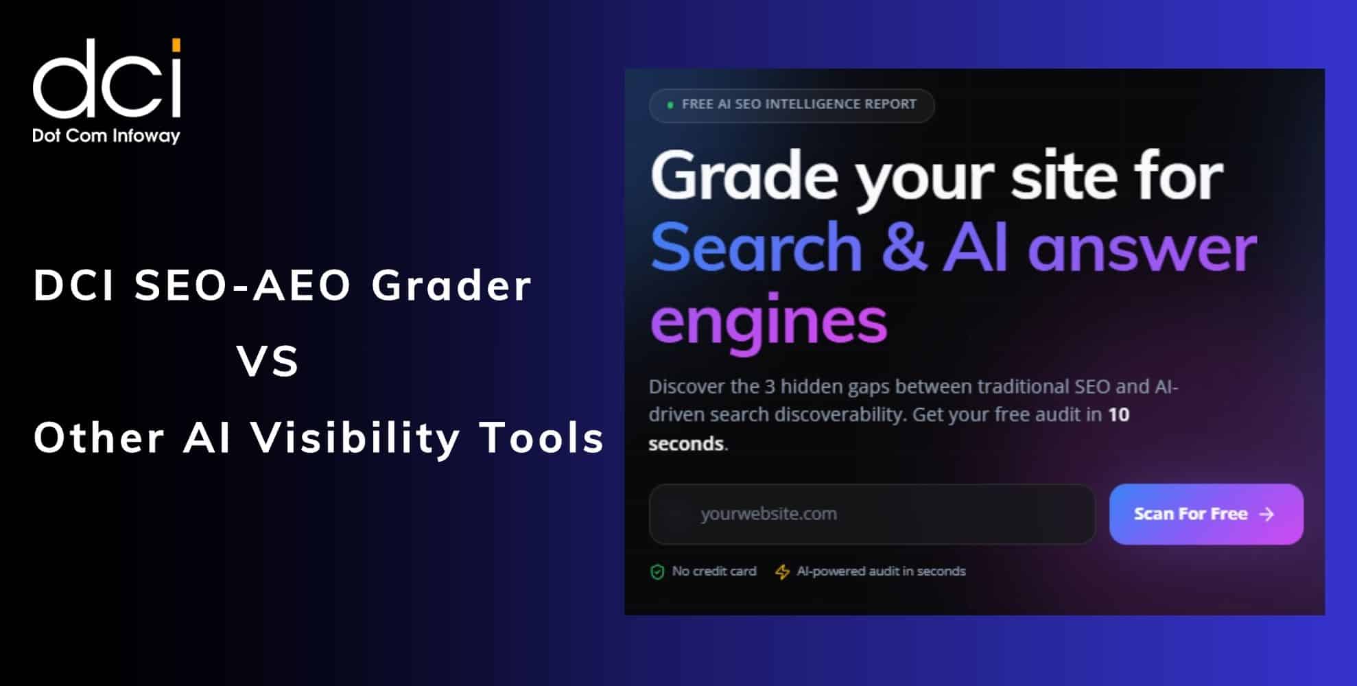
DCI SEO-AEO grader vs other AI visibility tools: what makes ours grade what actually matters
AI visibility is no longer defined only by search rankings. A website may perform well on Google and still remain absent when ChatGPT, Perplexity, Gemini, Copilot, or AI Overviews answer a customer’s question. DCI’s SEO-AEO grader tool evaluates whether...
 July 08, 2026
E-commerce in the zero-click era: how to make sure AI recommends YOUR product when shoppers skip the search results
The e-commerce buying journey is moving beyond traditional search, making AI product recommendations for e-commerce increasingly important. Shoppers now use ChatGPT, Gemini, Perplexity, and Google AI Mode to compare products and make purchase decisions. This creates a new visibility challenge....
 July 06, 2026
Email Marketing Is Not Dead: 7 AI-Driven Tactics That Are Driving Open Rates Beyond 35%
Email marketing is not dead. Generic email campaigns are. Customers now expect relevant messages based on their interests, behaviour, and buying stage. AI-driven email marketing tactics help businesses replace mass campaigns with predictive segmentation, personalised content, and smarter automation. Achieving...
 June 25, 2026
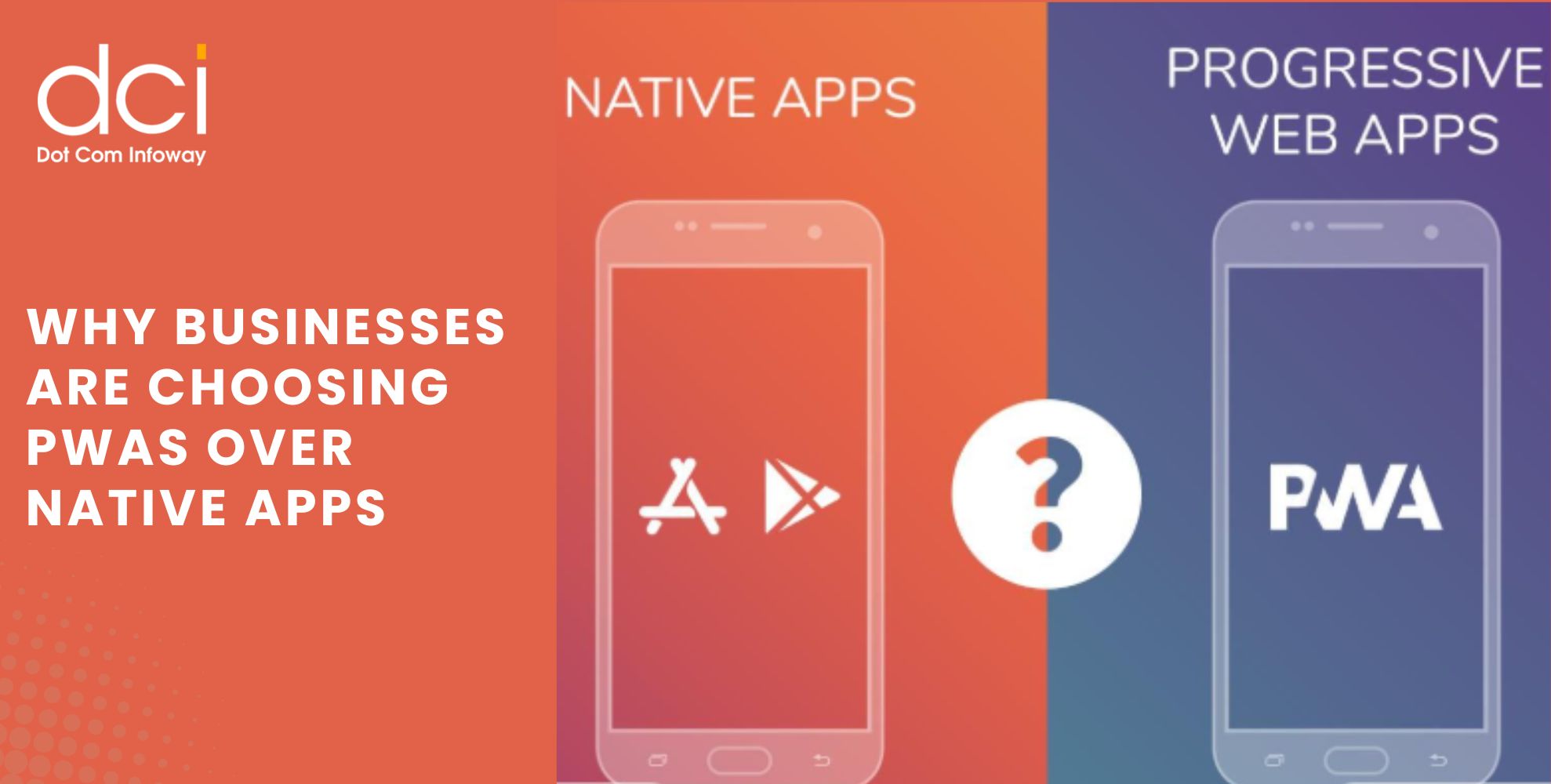
Why Businesses Are Choosing PWAs Over Native Apps: How One Brand Reached 3X More Mobile Users
Mobile users expect fast, reliable, and seamless experiences across devices. As businesses evaluate the best app development service strategies to improve customer engagement and maximize ROI, many are increasingly choosing PWAs Over Native Apps. Progressive Web Apps (PWAs) combine...
 June 22, 2026
50K App Downloads but Poor Retention: Which Metrics Matter More Than Installs?
Getting 50,000 app downloads is a milestone that many businesses celebrate. It often indicates that user acquisition campaigns, app store visibility, and marketing efforts are generating results. However, downloads alone do not determine whether an app is truly successful....
 June 18, 2026
How to Measure Your Website’s AI Visibility Before Your Competitors Do
The way people search online is changing rapidly. Instead of browsing through multiple search results, users increasingly rely on AI-powered platforms such as ChatGPT, Gemini, Perplexity, Claude, and Google AI Overviews for instant answers. As a result, AI Visibility...
 June 15, 2026
How Founder-Led Marketing Drives Business Growth: Insights from Dot Com Infoway’s Webinar
In today's highly competitive digital environment, businesses are finding it harder than ever to earn customer trust. Consumers are exposed to countless ads, social media promotions, and AI-generated content every day. As a result, authentic communication has become a...
 June 15, 2026
SEO vs AEO vs GEO: What Businesses Need to Win AI Search in 2026
The way people discover information online is changing rapidly. Instead of relying solely on Google search results, users are increasingly turning to AI-powered platforms such as ChatGPT, Gemini, Perplexity, and Google AI Overviews to find answers, compare solutions, and...
 June 12, 2026
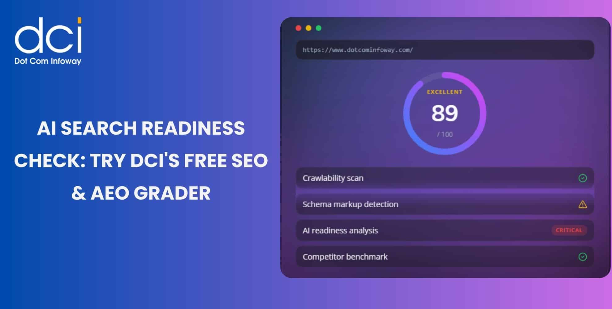
AI Search Is Reshaping Discovery: Use DCI’s Free SEO & AEO Grader Tool to Measure Your Website’s Readiness
Search is changing fast. Users now ask ChatGPT for recommendations, compare options on Perplexity, read Gemini summaries, and check Google AI Overviews before visiting websites. This shift makes the SEO & AEO Grader Tool important for brands that want...
Get the latest insights from Dot Com Infoway straight to your inbox.