Typography and Responsive Design
4 mins read
Typography and web design are deeply connected with one another, because great web design cannot be conceived without taking typography into consideration. Users view web pages in different environments and based on the device they use, they might experience font artifacts or other problems that may result in a bad reading and viewing experience.

What is typography?
Typography involves the use and design of typefaces as a means of communication. Typography actually began with the development of movable type and Gutenberg played a vital role to make this happen. However, at its roots, typography stems from handwritten letterforms and it encompasses everything from digital type, type on Web pages and calligraphy. Not only that, but it also includes calligraphers, type designers and designers using letters as part of their designs. In order to create a completely new design typography makes use of whitespace and typefaces through and around them.
Responsive typography
When a web designer builds websites, he will generally start by defining the body text. This is because doing so will dictate how wide the main column is going to be and the rest used to follow by itself. However, it seems that screen resolution was more or less homogenous until recently. Nowadays people can purchase screens that vary a lot in terms of resolution and size and this makes everything a bit more complicated for web designers.
Responsive typography is a concept that allows layout to adjust automatically based on the resolution of the screen. There are various ways to define it and they include:
- Adaptive layouts: The layout is adapted step by step to a specific number of sizes.
- Liquid layouts: The layout is continuously adjusted so that it matches any width.
Even though both of them feature disadvantages and advantages, adaptive layouts featuring the minimum amount of break points is the best, because in the end readability is what users appreciate and not a layout that has the same width as the viewport. The fact is this opinion is highly debated and in order to get optimal readability, there needs to be a specific amount of control over the column width and by using a liquid layout in this regard, it will only cause more problems than it can solve.
Things to consider for responsive typography
In the future the responsive web will be 99.9 percent typography and it seems that responsive design already comes with a plenty of macro typographic issues (column width, line height, type size). This means that in many ways, responsive design already incorporates this kind of typography.
It seems that typography is a large part of a well displayed web page regardless of type and many people don’t even know how important typography is to the possibility of them enjoying their favorite content anytime and anywhere they are. Be it the fluid or adaptive type, it’s used throughout the internet for correctly displaying fonts and text. It’s a serious matter that needs to be very much taken into consideration, so that users, regardless if surfing from their smartphone, laptop, tablet or desktop computer, can have their internet pages accurately displayed.

![The Game Marketing Guide: Pre and Post-Launch Strategies [Infographic]](https://www.dotcominfoway.com/wp-content/uploads/2023/09/DCI-Game-Marketing-blog-1.jpg)
Latest Posts
 June 25, 2026
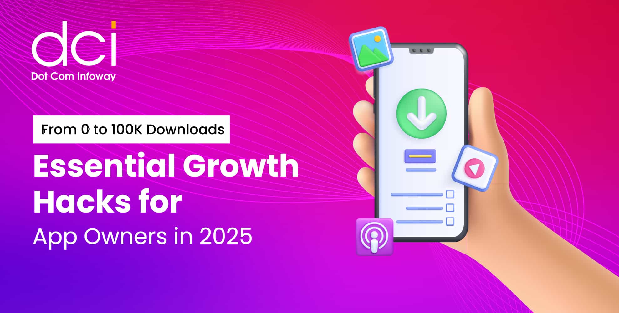
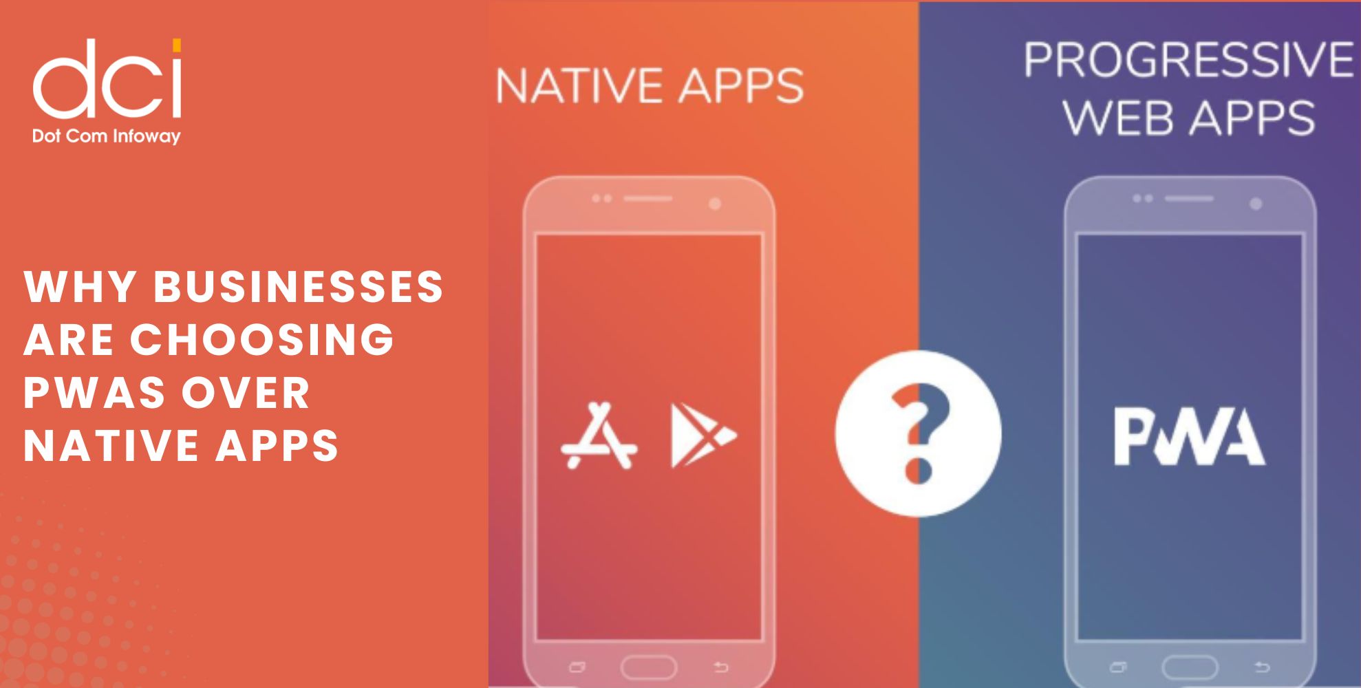
Why Businesses Are Choosing PWAs Over Native Apps: How One Brand Reached 3X More Mobile Users
Mobile users expect fast, reliable, and seamless experiences across devices. As businesses evaluate the best app development service strategies to improve customer engagement and maximize ROI, many are increasingly choosing PWAs Over Native Apps. Progressive Web Apps (PWAs) combine...
 June 22, 2026
50K App Downloads but Poor Retention: Which Metrics Matter More Than Installs?
Getting 50,000 app downloads is a milestone that many businesses celebrate. It often indicates that user acquisition campaigns, app store visibility, and marketing efforts are generating results. However, downloads alone do not determine whether an app is truly successful....
 June 18, 2026
How to Measure Your Website’s AI Visibility Before Your Competitors Do
The way people search online is changing rapidly. Instead of browsing through multiple search results, users increasingly rely on AI-powered platforms such as ChatGPT, Gemini, Perplexity, Claude, and Google AI Overviews for instant answers. As a result, AI Visibility...
 June 15, 2026
How Founder-Led Marketing Drives Business Growth: Insights from Dot Com Infoway’s Webinar
In today's highly competitive digital environment, businesses are finding it harder than ever to earn customer trust. Consumers are exposed to countless ads, social media promotions, and AI-generated content every day. As a result, authentic communication has become a...
 June 15, 2026
SEO vs AEO vs GEO: What Businesses Need to Win AI Search in 2026
The way people discover information online is changing rapidly. Instead of relying solely on Google search results, users are increasingly turning to AI-powered platforms such as ChatGPT, Gemini, Perplexity, and Google AI Overviews to find answers, compare solutions, and...
 June 12, 2026
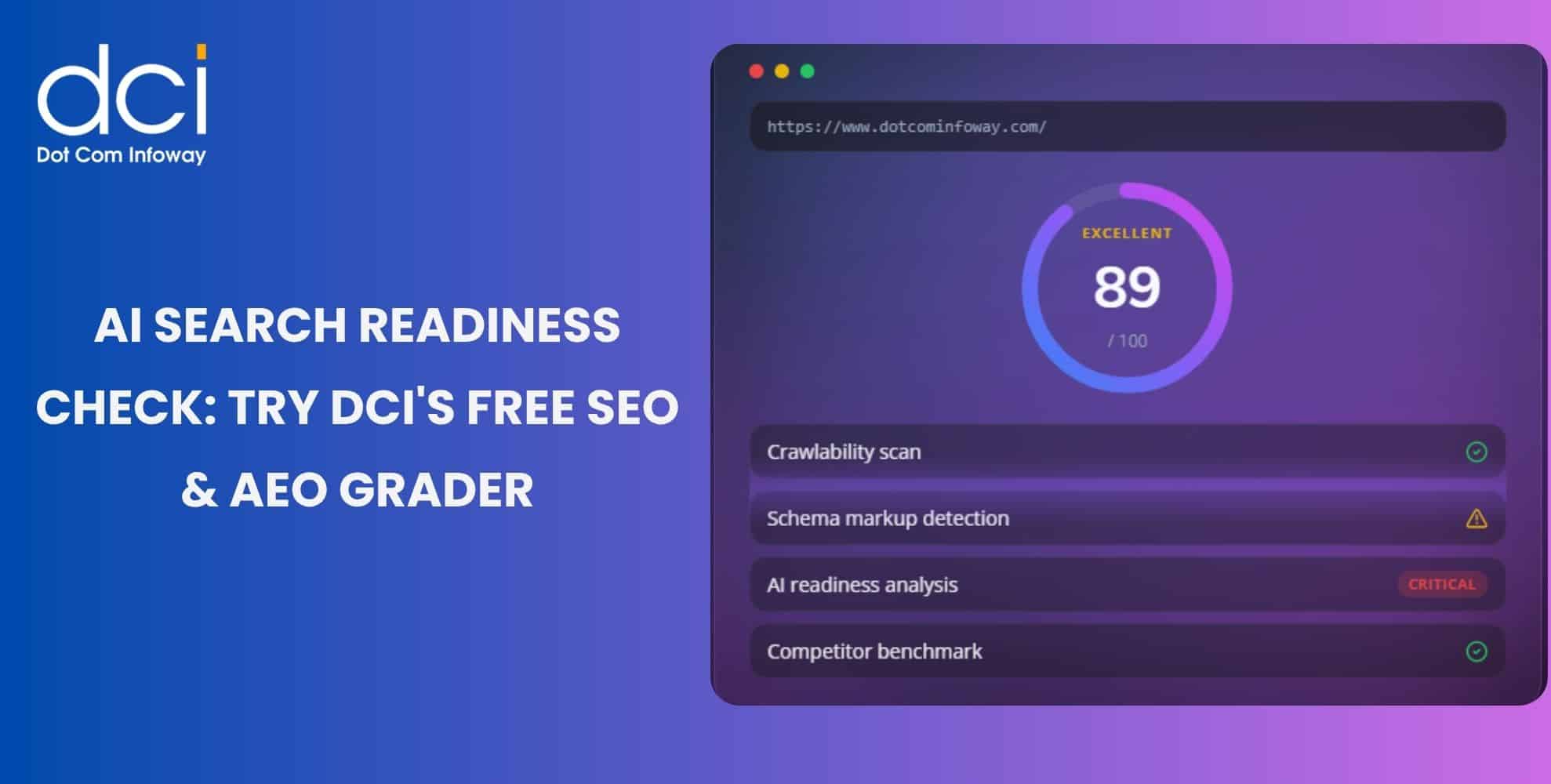
AI Search Is Reshaping Discovery: Use DCI’s Free SEO & AEO Grader Tool to Measure Your Website’s Readiness
Search is changing fast. Users now ask ChatGPT for recommendations, compare options on Perplexity, read Gemini summaries, and check Google AI Overviews before visiting websites. This shift makes the SEO & AEO Grader Tool important for brands that want...
 June 11, 2026
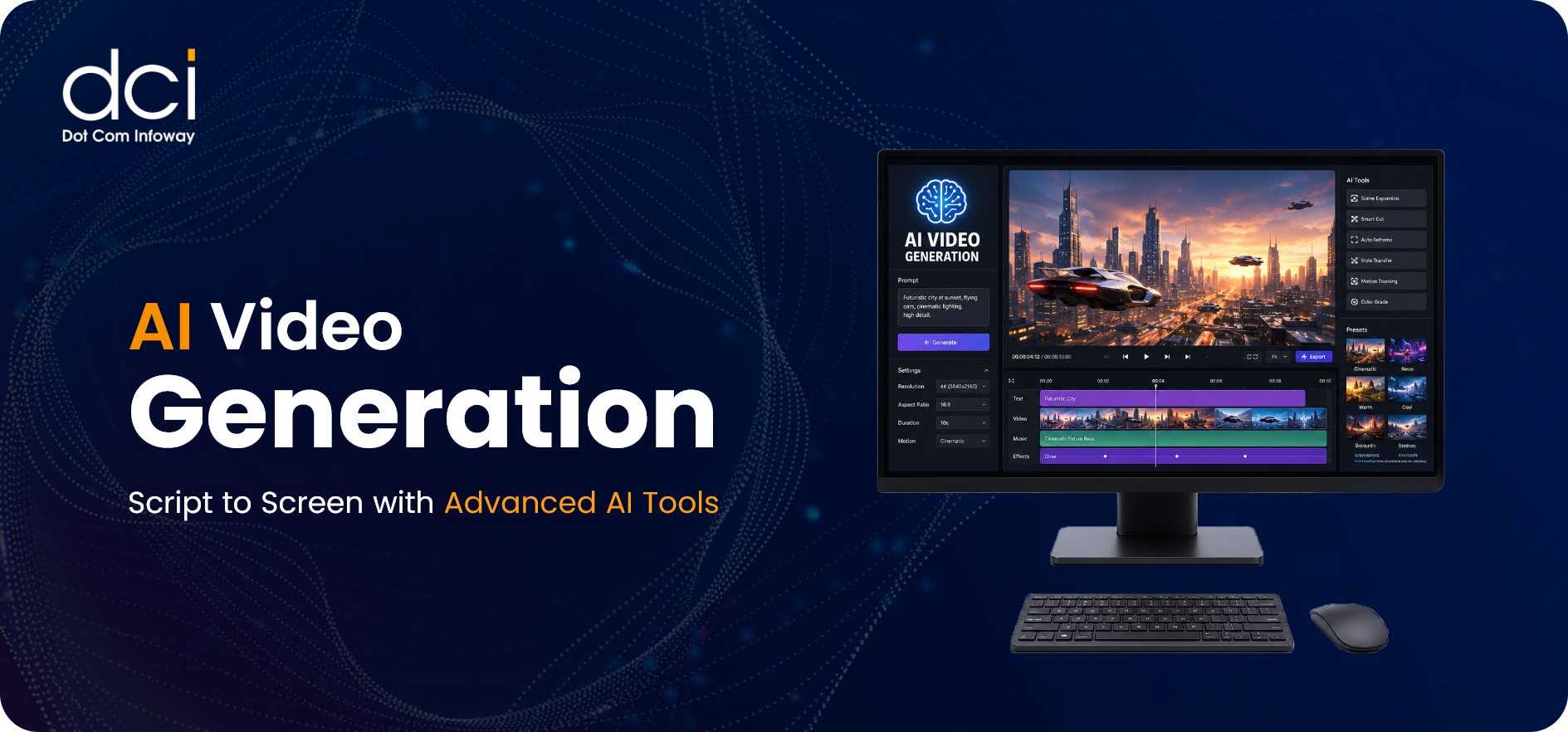
AI Video Generation: Script to Screen with Advanced AI Tools
AI video generation is reshaping how brands, creators, and studios produce visual content. With advanced AI tools, teams can turn scripts, prompts, blogs, images, or product ideas into ready-to-publish videos for ads, reels, trailers, explainers, and campaigns. How can a...
 June 10, 2026
E-E-A-T in the Age of AI: Why Google’s Trust Framework Is Now the Gateway to Both Organic and AI-Generated Visibility
Search visibility is changing quickly. Ranking on Google is no longer only about keywords, backlinks, and technical SEO. The Google Trust Framework now plays a major role in how brands build credibility across Google Search, AI Overviews, ChatGPT, Gemini,...
 June 08, 2026
The Honest Truth About AI Chatbots for Customer Support: What Worked, What Didn’t, and What Surprised Us After 6 Months
AI customer support chatbots are now a serious part of modern customer support. Businesses use them to answer common questions, reduce ticket pressure, and support customers outside regular working hours. But after six months of practical use, one thing...
 June 04, 2026
Stop Boosting Posts: The Digital Marketing Funnel That Delivered 3X ROAS for a D2C Brand in 90 Days
Boosting posts can increase visibility, but it does not always increase revenue. For D2C brands, the real challenge is not just getting more clicks; it is turning the right traffic into paying customers. A digital marketing funnel for D2C...
Get the latest insights from Dot Com Infoway straight to your inbox.